About Author
Chris Ryan
Chris Ryan is an accomplished promoter, event planner, producer, activist, counselor, poet and blogger. Within the course of two and a half years Chris Ryan has worked with some of NYC's most established promoters/event planners, been named 2007′s GaySocialite of the year, granted a promoter of the year award from NYC's most famous gay establishment, Splash. He's worked in some of NYC's top venues including; Avalon, Capitale, Cipriani, Cielo, Pacha, Element, Le Poisson Rouge, XL, G Lounge, Plumm, Hilton Hotel, Indigo Hotel, Spirit, Myst/Quo, Splash, The Ritz, Vlada, Roseland Ballroom, Heaven, etc.In 2008, Chris Ryan has begun to unveil some of the most innovative & unique parties New York City has ever seen. The Fusion events "fuse" together all disciplines of art into an event that remains diverse yet cohesive at the same time. ChrisRyanNYC.com won best gay promotions website from NYC Event Patrons in 2008 & he was granted an award from the Jim Owles Liberal Democratic Club, Gov. Patterson & Michelle Clunie (QAF) saluting him for his hard work in nightlife. Chris Ryan has also begun working with many renown companies, including; doctors, lawyers, physicians, modeling agencies & more. Chris Ryan has been responsible for wide-scale promotions for all these companies & generating tremendous business. Chris Ryan has even started to become National with events taking place in LA & Miami this year.In May of 2009 Chris Ryan received the very prestigious honor of being named a "40 Under 40″ Gays in America by the Advocate Magazine. He also created three successful parties that generated over 1,500 patrons each. In January of 2010 Chris Ryan was featured as one of the top promoters to look out for in Noize Magazine Chris Ryan joined forces with legendary promoter/event producer, Lee Chappell and created one of the most talked about events of all 2010, Desire @ Capitale. Chris Ryan and Lee featured one of the most outstanding artists NYC has ever seen, "Oh Land." Her performance coupled with an exquisite and unforgettable set design added to this extravagant event that held over 1,000 patrons in one of NYC's most successful PRIDE events! Chris Ryan then joined forces with legendary Pacha promoter, Rob Fernandez in addition to Jake Resnicow and Tommy Marinelli to bring one of the largest and most successful parties worldwide to NYC, MATINEE. The event on Governor's Island saw over 2,000+ attendees and one of the most ambitious productions ever.In 2011 Chris Ryan started Emerge Music Promotions with business partner Darren Melchiorre. Emerge Music promotions began signing artists with plans to develop and market the artists to the community at large. Emerge Music promotions has big events planned for 2012 and 2013. Chris Ryan debuted the IMAGE events which took place on top of two of NYC's most beautiful rooftop venues, Rare View and Indigo Hotel. The events were blogged everywhere and featured the fashion designs of several clothing designers, artists and photographers. Chris Ryan felt that fashion and art should be displayed at every event and attracted the likes of Malan Breton, Calvin Klein and even Katy Perry. Chris Ryan began an extremely successful event which incorporated the concept of a house party into a nightclub atmosphere. The event Twist'D at G Lounge has been one of the most talked about events in NYC and allows it's audience to play nearly-naked Twister, beer pong, flip cup & more with other attendees. Chris Ryan was granted an excellence in volunteering award from AVP (Anti-Violence Project) for all his efforts in supporting the organization.2013 has a very promising landscape on the horizon and Chris Ryan is complacent in saying "you haven't seen anything yet!"
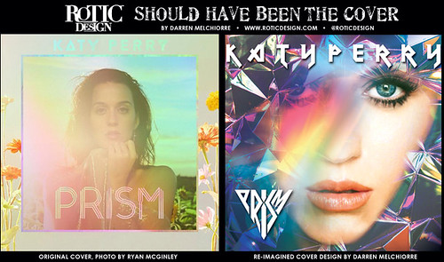 SHOULD HAVE BEEN THE COVER.